Aperture

A UX/UI design concept for a photography
course platform designed to make learning
creative skills simple and engaging.

ROLE
UX/UI Designer
TYPE
Web Design
YEAR
2026
THE VISION
Making photography more accessible
Aperture was designed as a modern photography course platform that makes learning feel accessible and engaging. The goal was to create a clear, intuitive experience that helps users discover the right courses, enrol with ease and continue developing their photography skills at their own pace.
USER JOURNEY
From curiosity to confidence
A simple, intuitive journey that takes users from discovering a course to building new skills and achieving their creative goals.  
Discover
Browse courses
for inspiration
Explore
Filter and compare
course options
Choose
View details and
select a course
Enroll
Complete a simple
checkout process
Learn
Track progress
and build skills
DESIGN DIRECTION
Bold imagery meets
a clean, editorial interface.
The visual direction for Aperture combines bold photography with a clean, minimal interface to reflect the creativity of the platform. Deep teal creates a consistent foundation, while vibrant magenta and yellow accents bring energy to key elements. Expressive typography and colourful imagery add personality, while the lighter content areas keep the experience clear and easyto navigate.
EARLY EXPLORATION
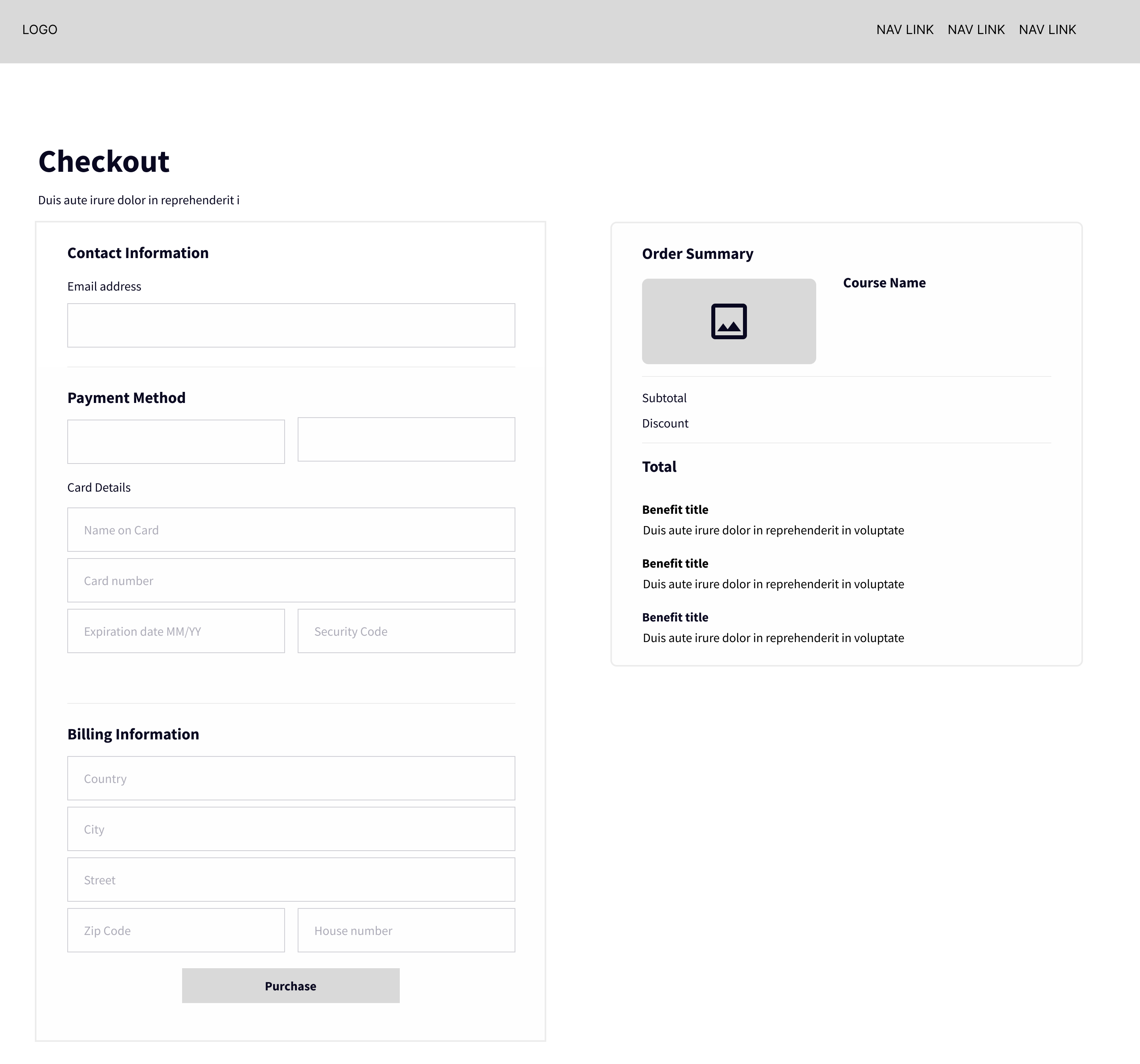
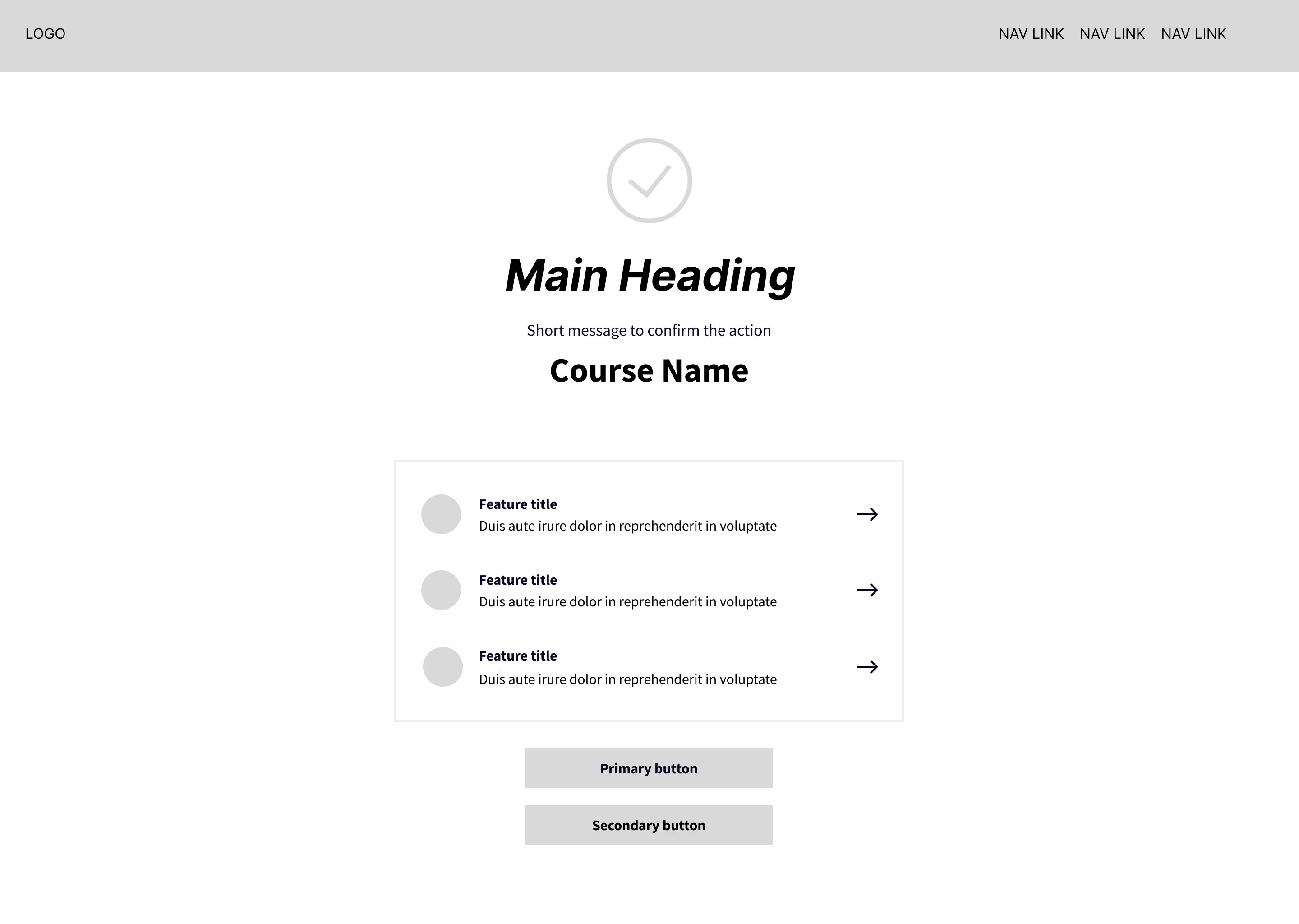
Wireframes
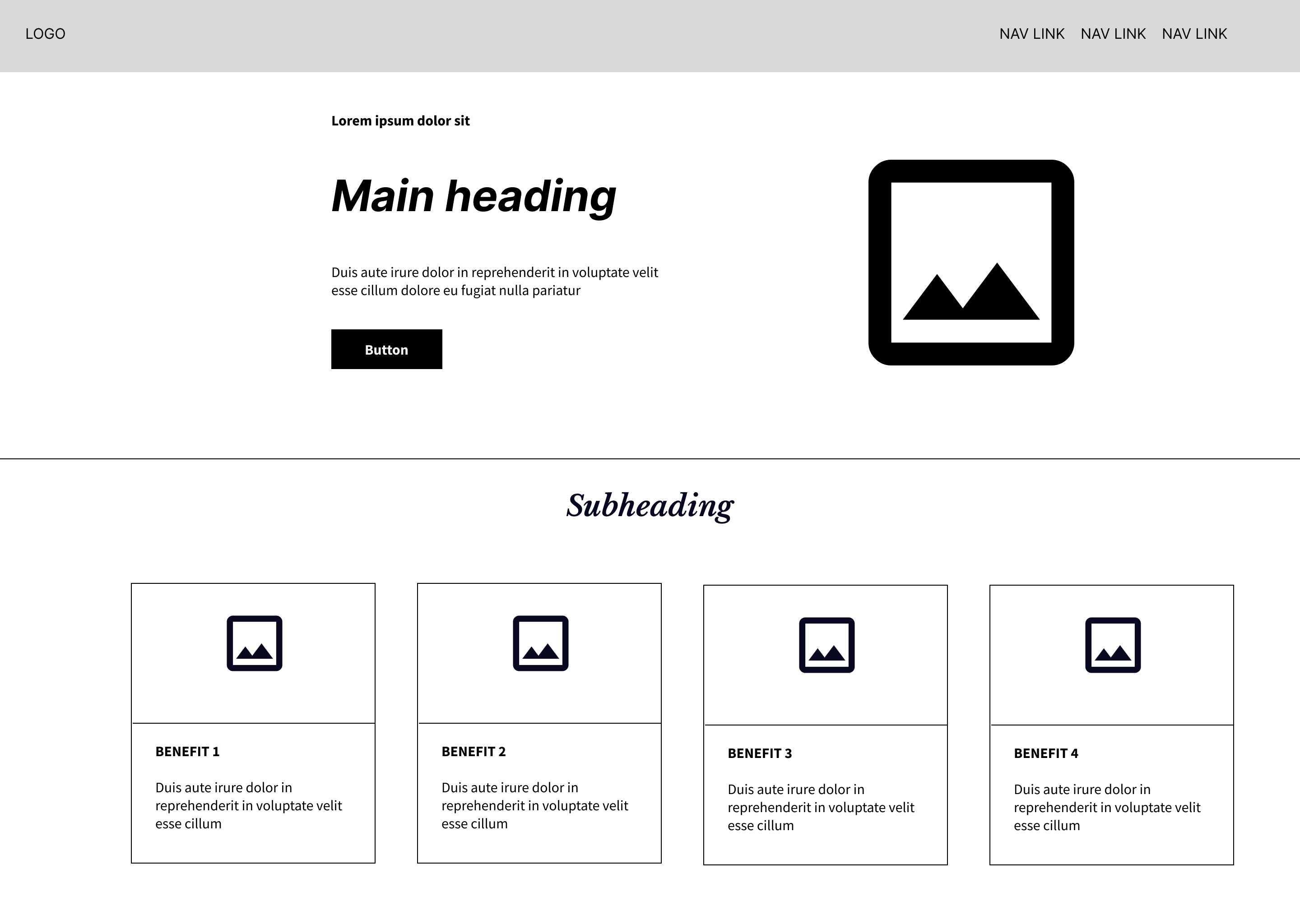
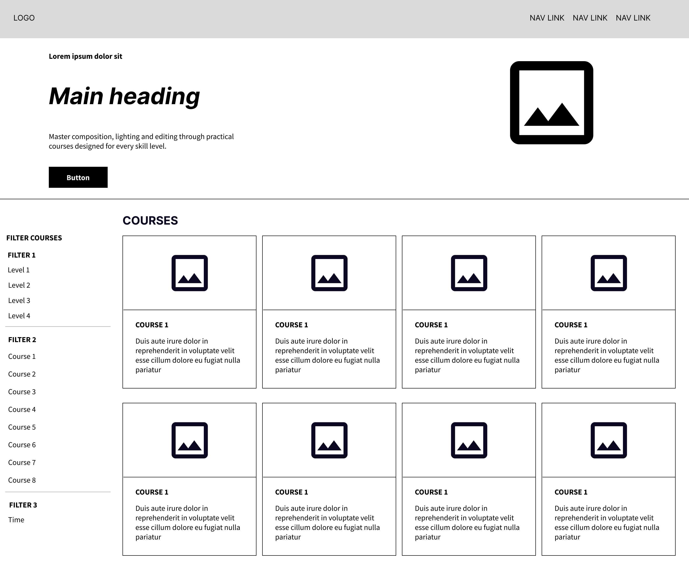
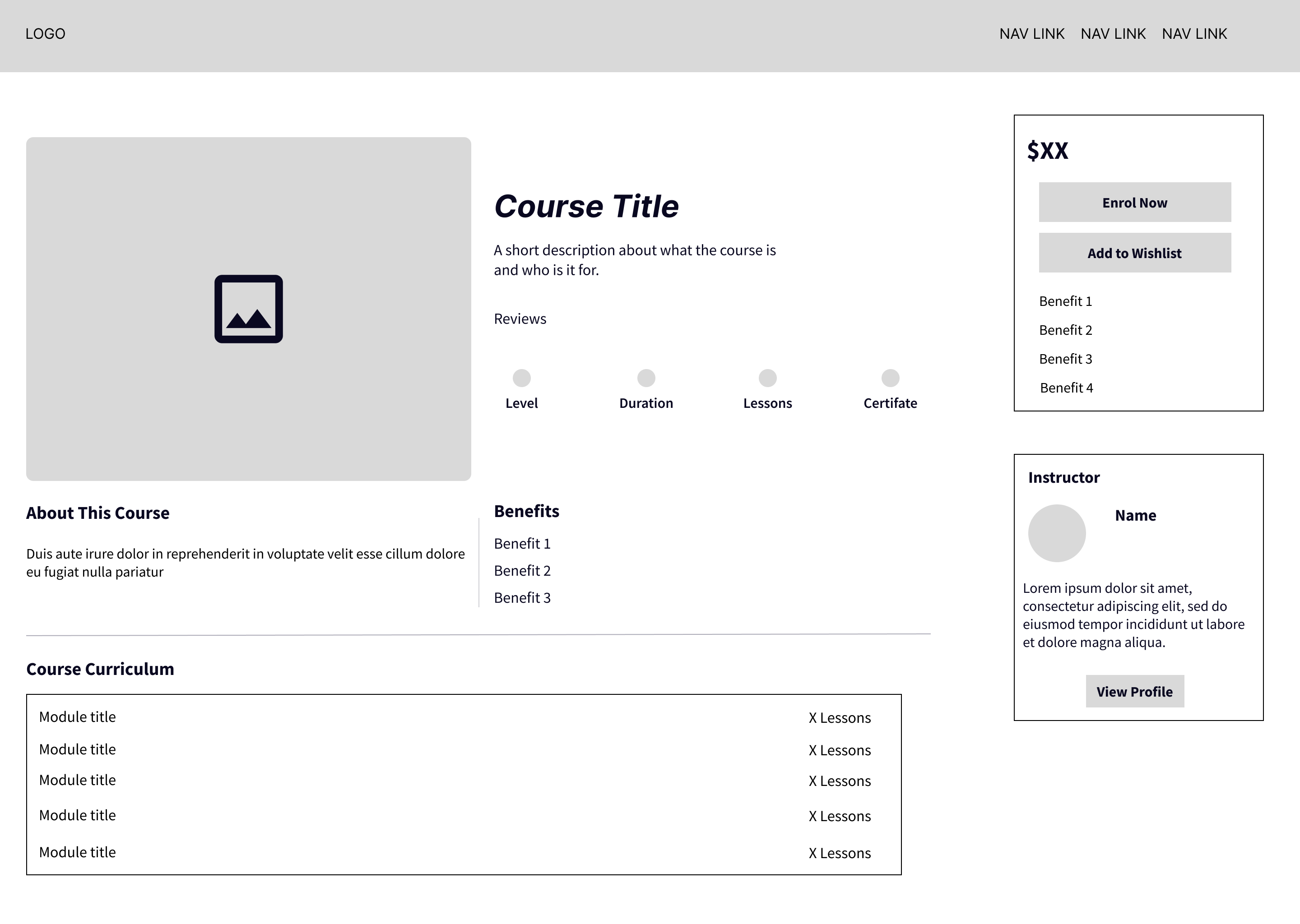
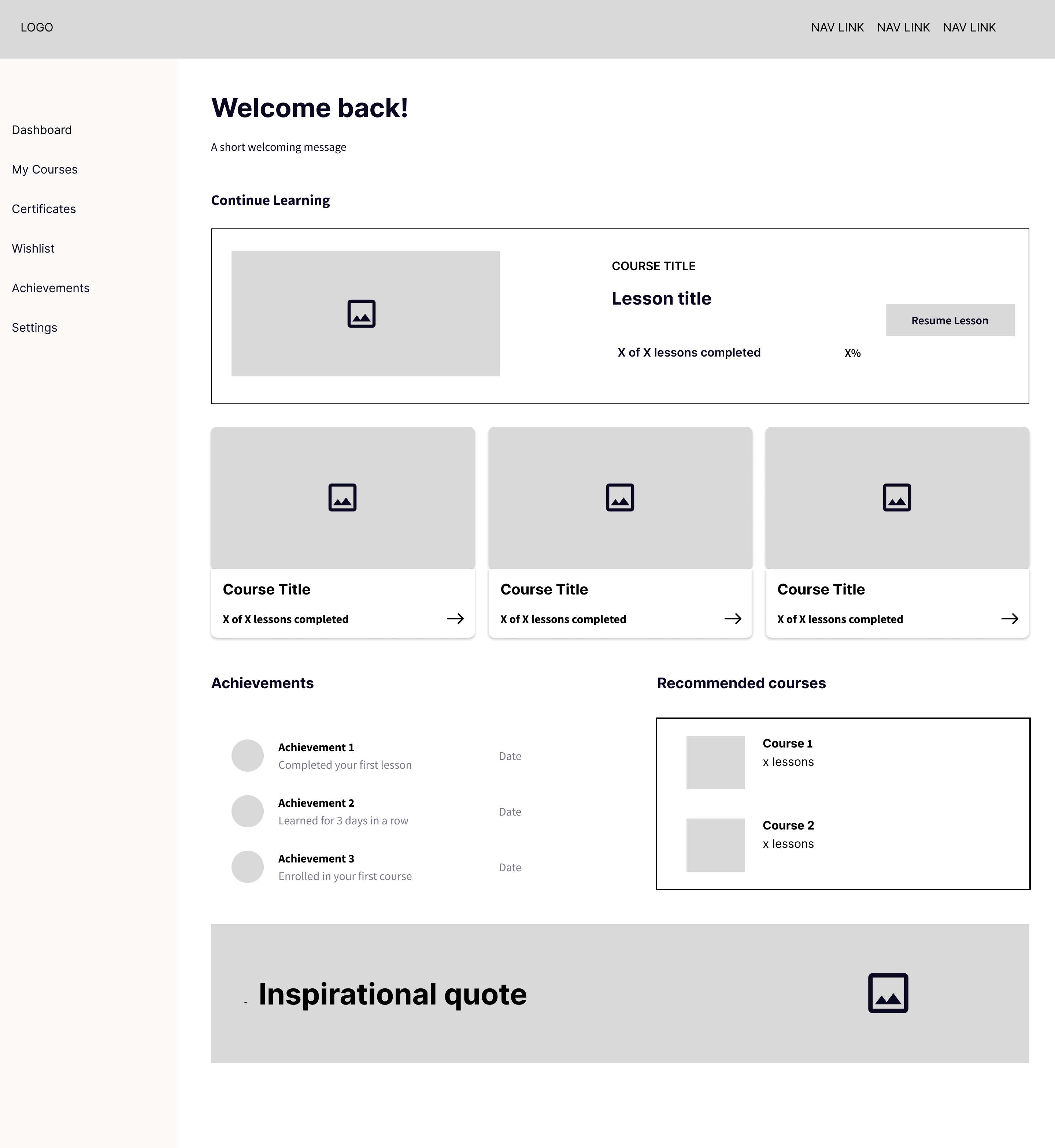
Early wireframes focuses on establishing a clear content hierarchy and creating a simple journey from discovering a course through to enrolment and learning.
FINAL DESIGN
Putting the experience together
A closer look at the key screens and features designed
to make learning photography simple, engaging and rewarding.
Homepage
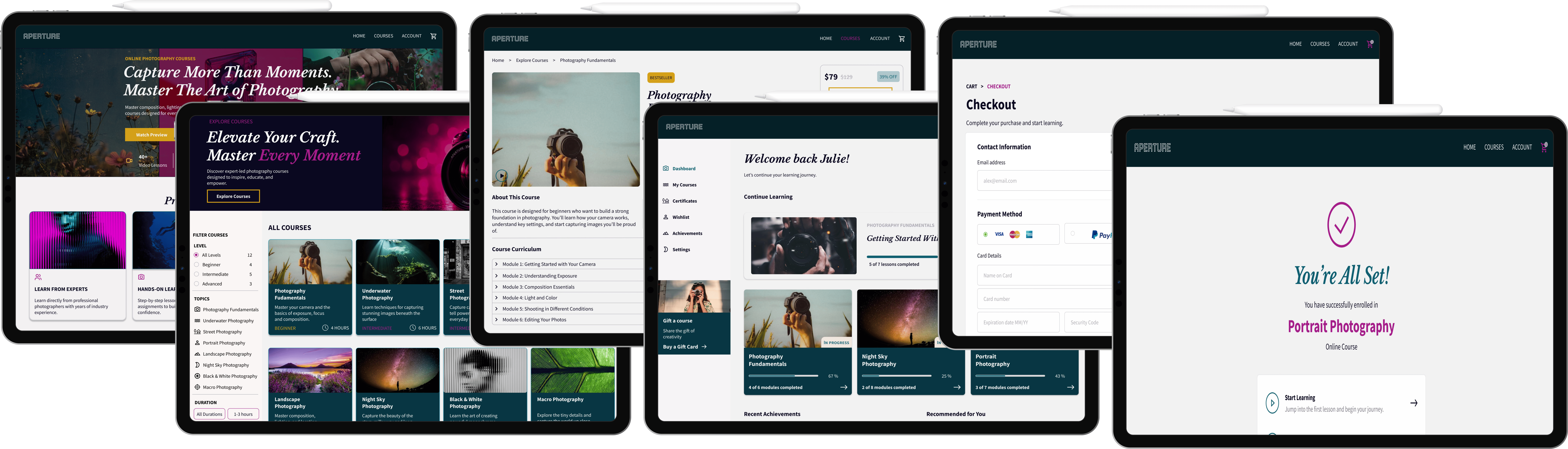
The homepage was designed to immediately showcase the platform while guiding users towards exploring its photography courses. A bold hero section combines striking imagery, clear messaging and prominent call-to-action buttons to encourage engagement. Key course benefits and platform highlights are presented in an easy-to-scan layout, helping build trust while giving users a quick overview of what they can expect.
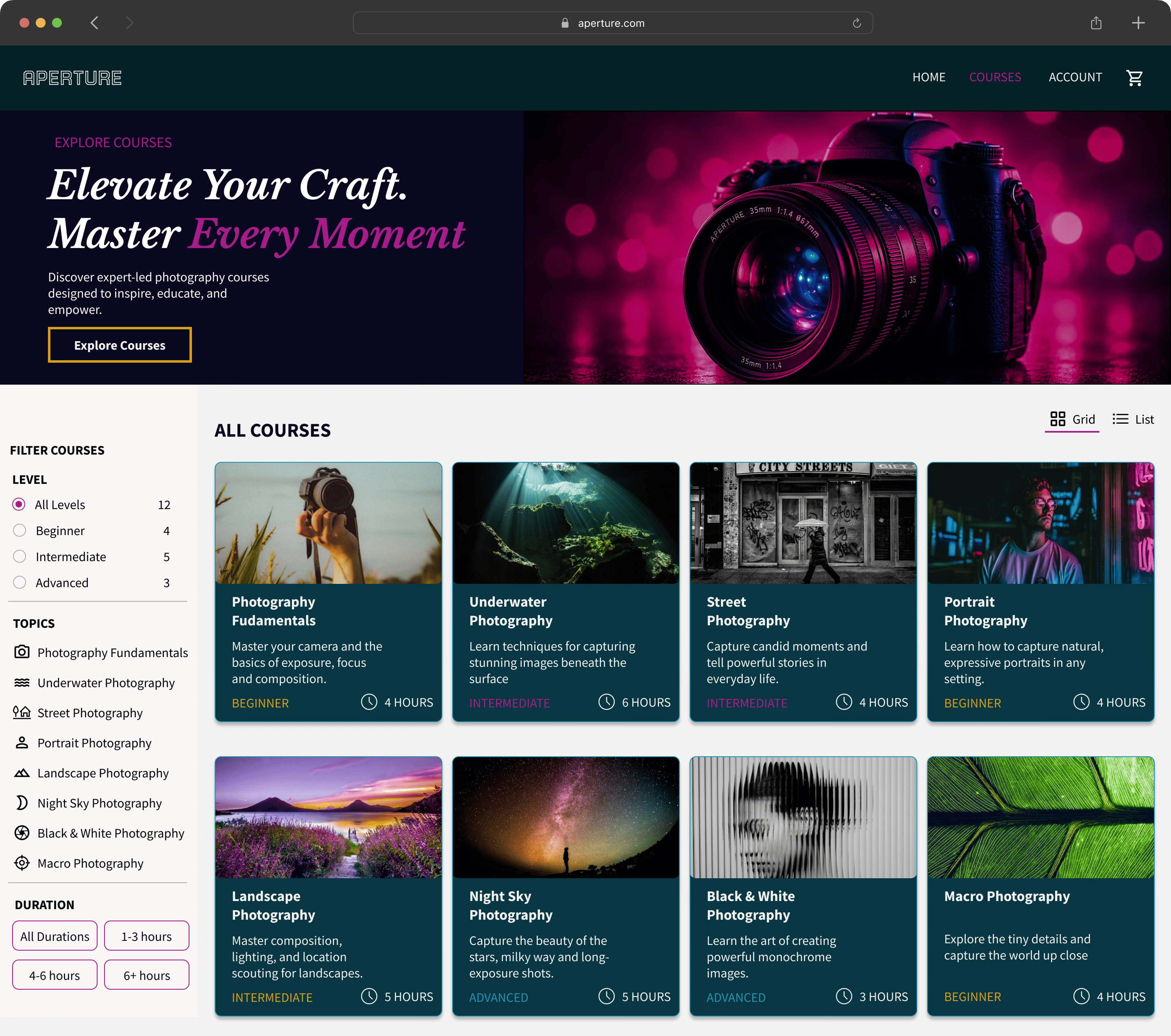
Explore Courses
The Explore Courses page was designed to make browsing and discovering photography courses simple and engaging. A bold hero introduces the course library, while an organised grid presents key information including course descriptions, skill level and duration. A dedicated filtering sidebar allows users to narrow results by experience level, topic and duration, with grid and list views offering flexibility. Clear navigation and information hierarchy help users quickly find courses that match their interests and skill level.
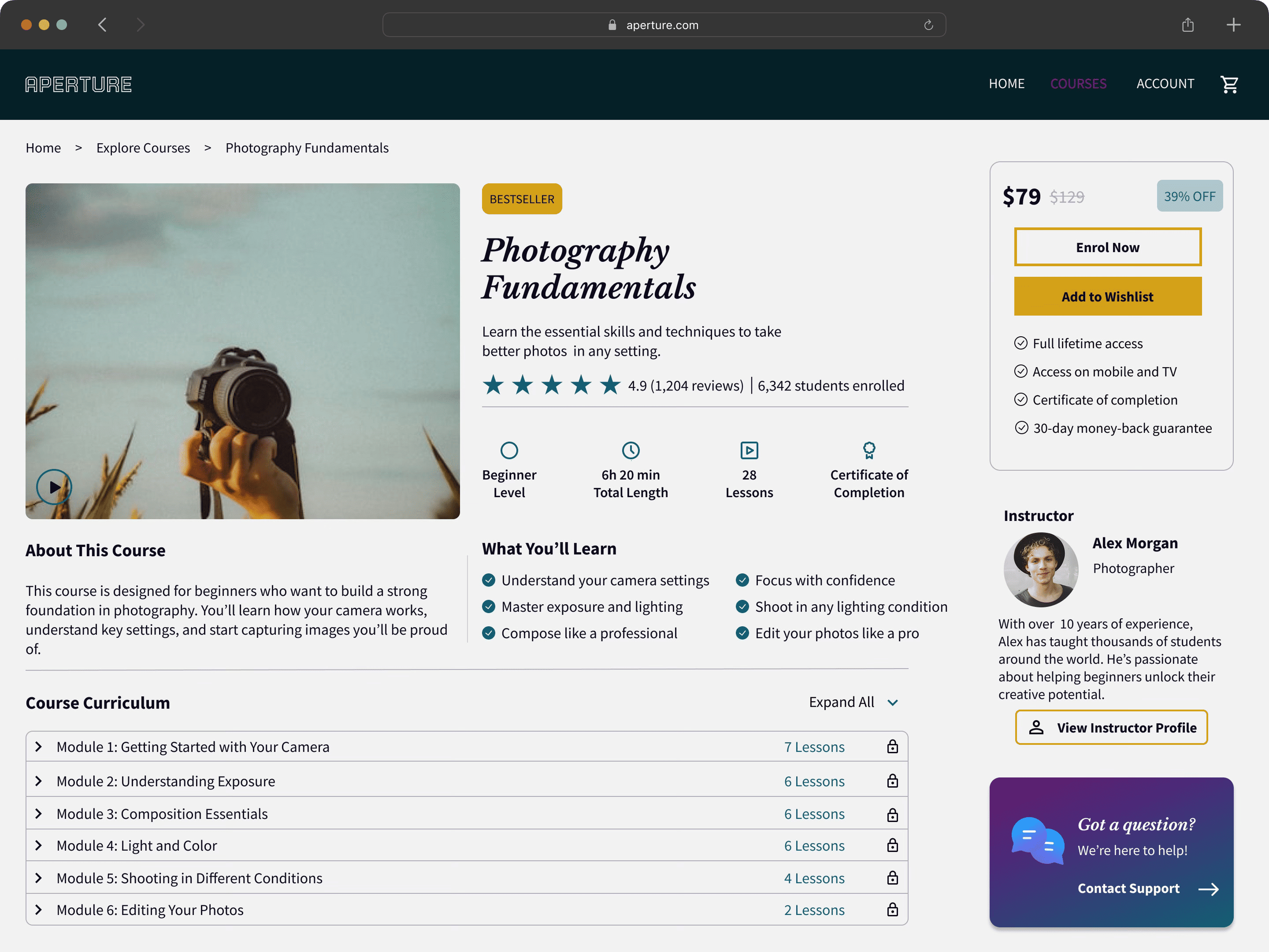
Course Details
The Course Details page gives users with all the information they need before enrolling. A clear course overview highlights the title, description, ratings, learning outcomes and essential details such as course duration, lesson count, skill level and certification, helping users make an informed decision.The page also includes a structured curriculum preview and an instructor profile to build credibility and trust. A dedicated enrolment panel displays pricing, lifetime access and key course benefits, while the clean layout and clear information hierarchy create a seamless and user-friendly enrolment experience.
Student Dashboard
The Student Dashboard was designed to give learners a personalised space to track their progress and continue their learning journey. The dashboard highlights the user’s current course, learning time and completion progress, allowing them to quickly resume lessons. Additional sections showcase enrolled courses, recent achievements and personalised recommendations, while clear sidebar navigation provides easy access to courses, certificates, wishlist and account settings. The clean, organised layout keeps important information accessible at a glance and creates an intuitive, motivating learning experience.
Checkout
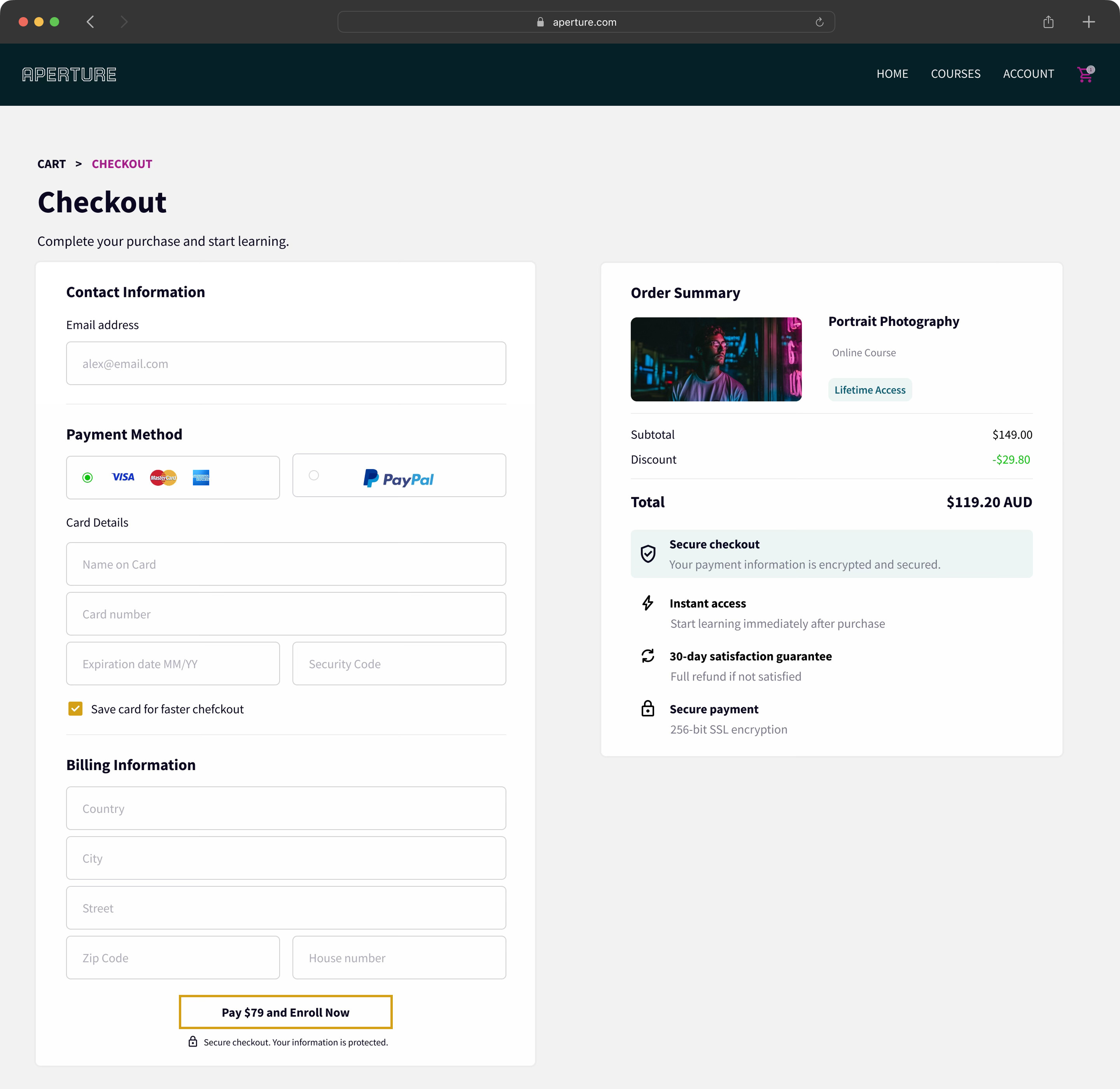
The Checkout page provides a simple, secure and frictionless purchasing experience. A clean two-column layout separates the payment form from the order summary, allowing users to complete their purchase while easily reviewing course details, pricing and discounts. Multiple payment options, streamlined billing fields and a clear call-to-action help reduce friction throughout the checkout process.To build confidence, the page highlights secure payment, SSL encryption, instant course access and a 30-day satisfaction guarantee. The uncluttered layout and clear information hierarchy create a trustworthy experience, making it easy for users to complete their enrolment and begin learning immediately.
Confirmation
The Confirmation page provides users with reassurance after completing their purchase while guiding them towards the next steps in their learning journey. A clear success message confirms their enrolment, while helpful guidance explains how to access the course, start learning and find their receipt. Prominent call-to-action buttons allow users to either begin their course immediately or continue browsing the course library. The clean layout and clear visual hierarchy create a seamless transition from purchasing a course to starting the learning experience.

Designed to inspire every photographer

Every page, interaction and detail was thoughtfully designed to inspire creativity
while making photography education accessible, engaging and easy to navigate.